


Device Control - Touchscreen enhancing the User Experience
PROJECT OVERVIEW
This was an exciting project and the one I was given the moment I walked through the door on my first day. User Experience Research and Design, UI Design, Interaction Design and Information Architecture all in one super nifty device control interface.
The problem: User acceptance of the current device control unit was less than acceptable. Facility staff were struggling to explain it. Users were struggling to use it. Yet the product was on the rise and selling like hotcakes. A pretty perfect place to be if you are a problem solver. Could we improve UX? Could we increase user acceptance? Could we find a way to increase users love of this product even more by knowing the user? Heck yes we can!
On my first day I began gathering research from internal stakeholders and users and started charting out my approach to undrstanding what might get us some traction with users.
MY ROLE
UX/UI/IxD/IA
User Surveys
Comparative Analysis
Personas
User Flows
Iterative Wireframing
Formative Evaluation
Protoyping
A/B Testing
Interface Design/Icon Design
Visual Design
User Testing
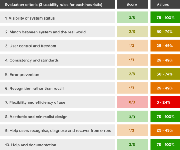
Initial approach - Heuristic Evaluation
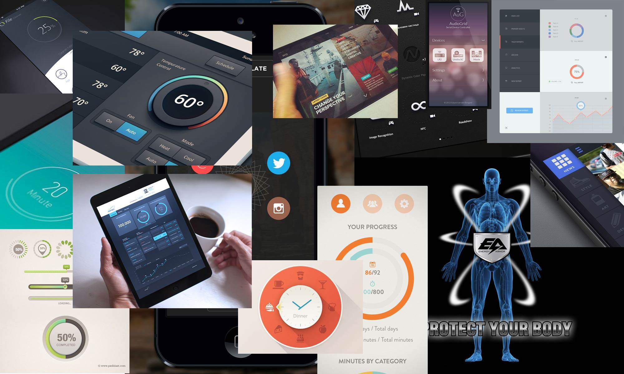
Comparative Analysis

Customer Discovery
Before any design efforts began, I had to endure a cacophony of user complaints, client confusion and rhetoric that had been building for years. Internal stakeholders, clients and users all wanted to be heard.
Users were categorized as actual product users & facility staff (clients) and personas were derived from these two groups. We chose to query our groups with a System Usability Survey from differing perspectives to get the subjective feedback. Later we went face to face with interviews of the two different groups. We setup a survey station at a very popular workout facility. Each member who offered input got a free add on of HydroMassage use for one month. Research covered all user types. Interview efforts included questions about usage, lifestyle desires and expectations as well as exploratory queries to determine new directions and user desires. On location we were able to investigate any interesting feelings or emotions regarding the product as experienced by those who used it repeatedly (This was not a usability test - no UI test during interviews).
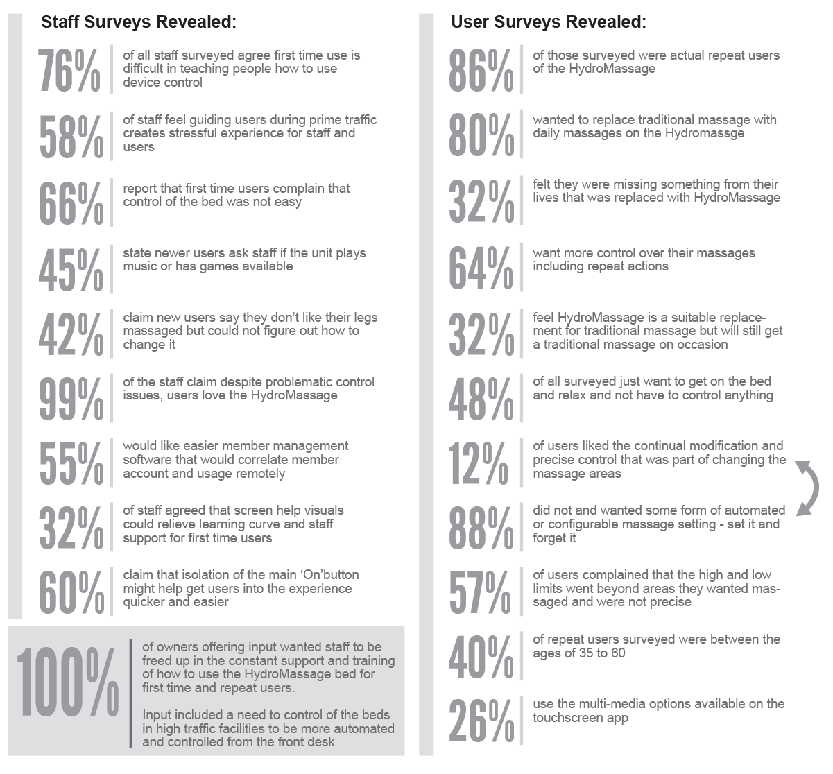
Quantitative & Qualitative Research
Discovery initiatives helped determine possible design direction for the future versions of the touchscreen control. Interviews helped see two perspectives primarily, "Past" & "Future". What impact did the past design/features have & what things might customers desire in future releases. What could make this product truly "Loveable"? Evaluating past experiences allowed us to further define personas and behaviors to determine pain points along the user journey. In this discovery they freely shared their day in the life, their pain and offer suggestions for better features. The interviews were casual, allowing the user to speak and the moderator to peel back layers of detail. Later interviews included a series of contingency questions formulated to dig deeper only where needed and capture user statistics in an efficient manner (e.g. "Do you enjoy multimedia content during your massage?" - if "Yes" the interactive would steer towards a priority approach of selection. If "No" we would not bother user with further questioning).
Personas
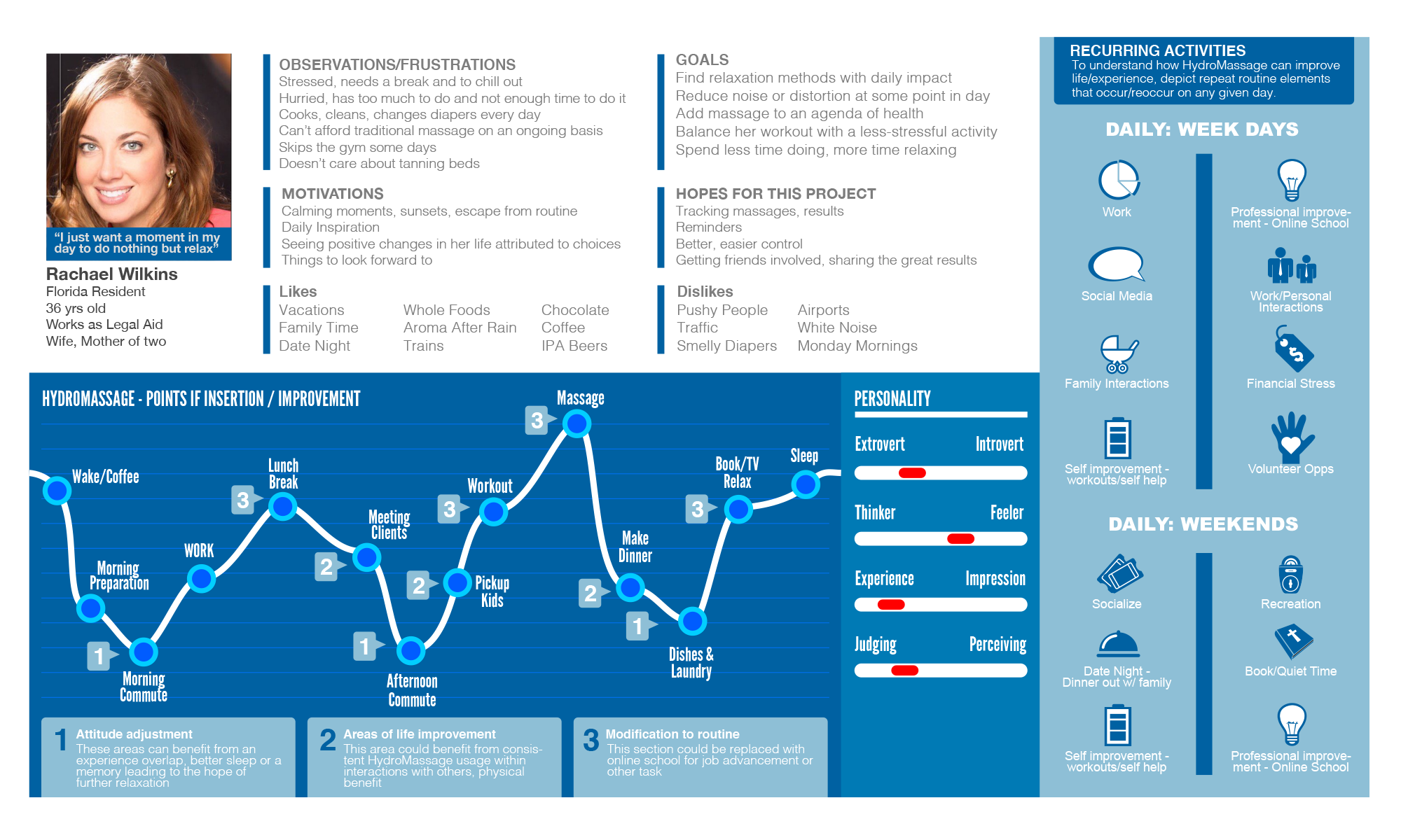
We wanted to know our primary users better. To see where this product could enhance their lives. We needed to discover personas and the day to day journey of a user. We developed five overarching research principles:
- Understand a users personal time value and how they want to use it
- Understand users point of entry to the unit - most common
- Understanding why the experience of a relaxation device had to be less stressful and what made it more stressful
- What types of control was really necessary to the user, when and how it impacted their use
- What ancillary combinations of media or interaction would enhance the user experience
When personas were constructed, a focus was added to structure a mood line through each developed persona. This allowed us to collaborate, illustrate and contend user feedback into an understanding of the users high and low points of a particular day. We could then examine how we could improve solutions for greater user impact. When communication to stakeholders and execs came about, this type of persona detail helped us explain the potential of advanced UX measures, development of additional controls and the return of initial investment. We were then also able to request additional time & dollars to further the R&D of the project and any crossover development needed for success.

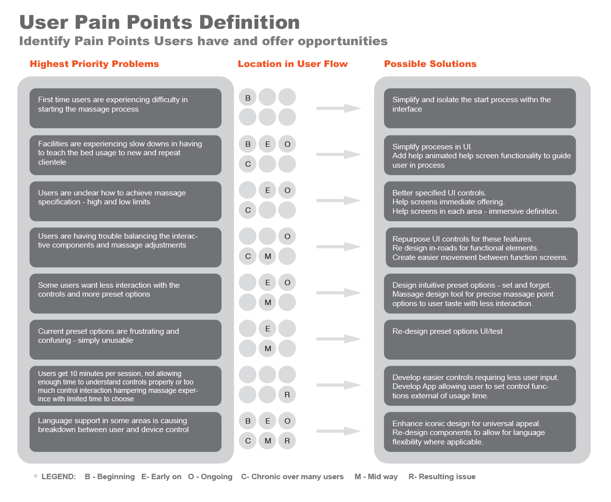
Defining Pain Points
Before creating a journey map of a full process or sub process within product usage, I may define the points from interviews that were repetitious and define insight as to where problems exist in the product usage life line to determine consistent problems amongst many users. This can be a collaborative opportunity to discuss pain points with the team, surface the highest priority problems and initiate a design sprint or other problem solving effort to build a backlog of solutions. Defining objectives and key results can be a great way to map out solutions and what it might take to achieve and what outcomes you can expect.
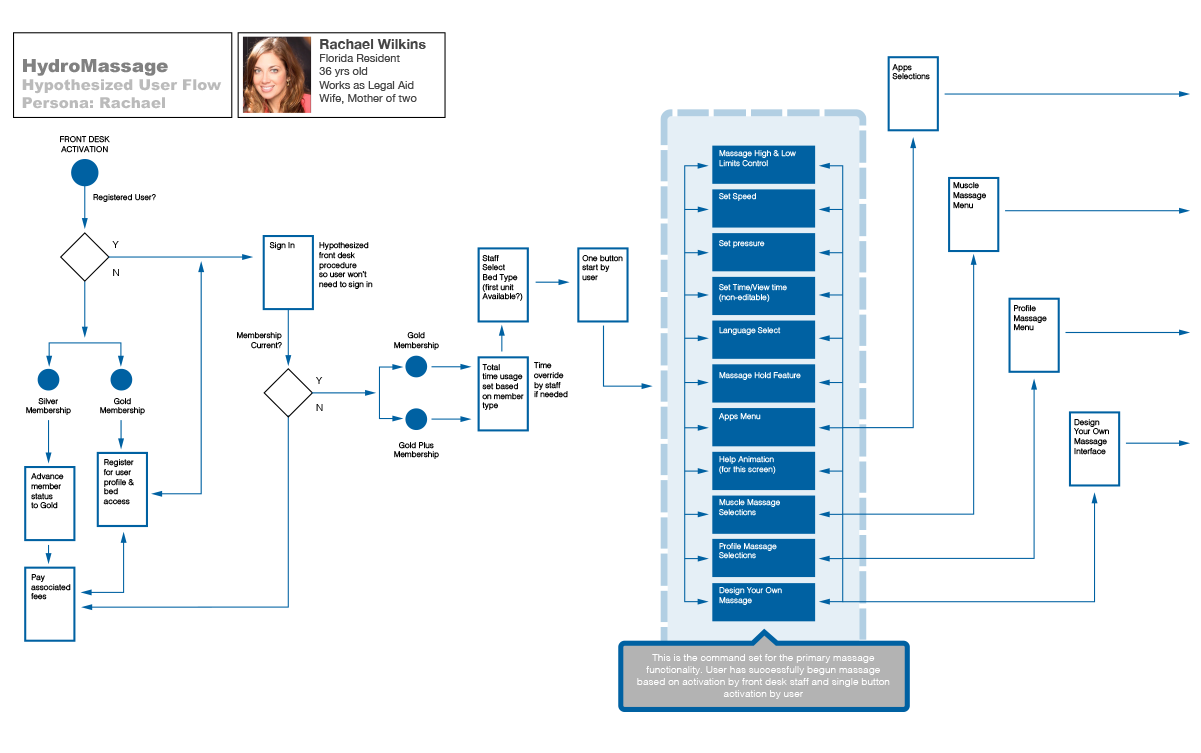
User Flows
User flows were generated with persona construction in mind based on user observations, goals, motivations, etc. We were able to hypothesize several flows based on potential actions that would solve user dilemma but might live outside of the primary application UI as we saw it. The decision was made to explore several UI modifications or additions based on user research. We realized the solutions to user input would need to be achieved by developing certain internal and external solutions, but client relationship, revenue opportunities and UX solutions were now in scope as we understood more of what users were thinking and dealing with in their lives. We were also able to see the relationship between facility staff, users and the massage beds and could potentially solve several problems with new solutions. I was always told in my life "Theres 10 ways to skin a cat"

---


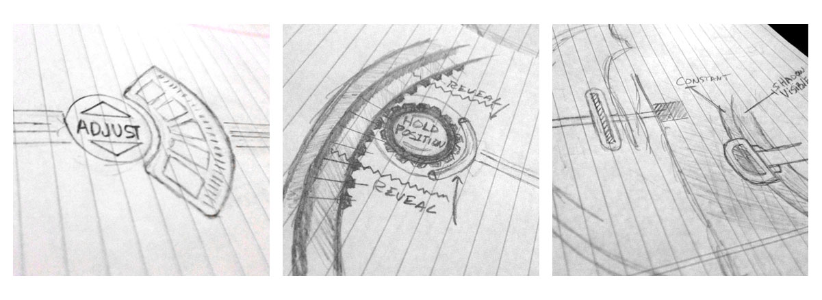
Imagining on Paper
Aw we explored opportunities to communicate UX on screen, ideas continued to flow in enhancing portions of UI to enhance user control. Sprints were defined in agile fashion to accomodate new ideas. The beauty of this development was in that we controlled 100% of the technology and the UX since we were creating the tech from the gorund up (i.e. circuit boards, wifi comm, bluetooth controllers, etc.) allowing us to achieve a level of control far more promising than previous versions.
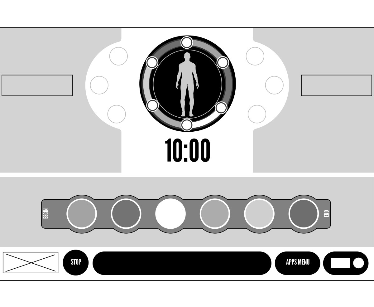
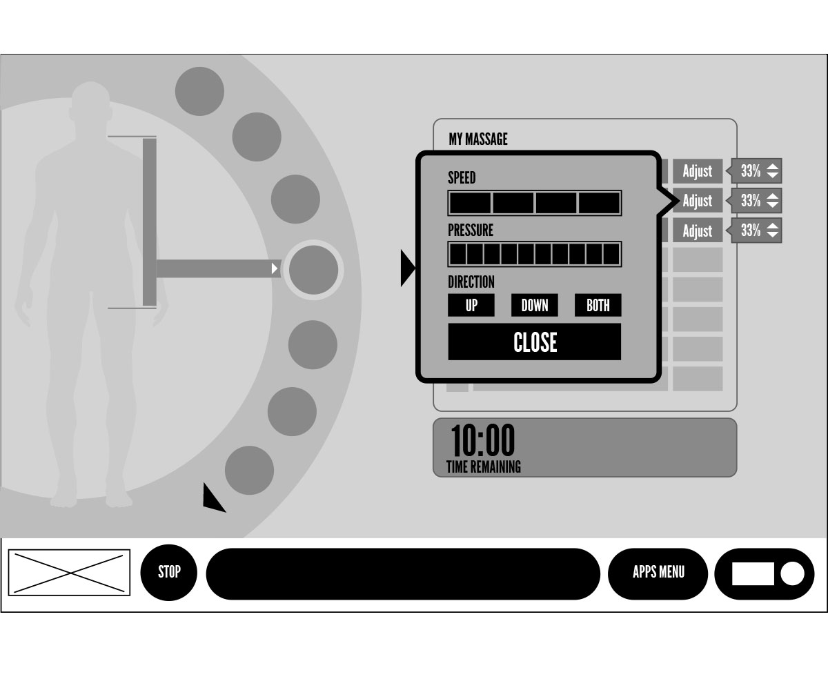
Iterative Wireframing
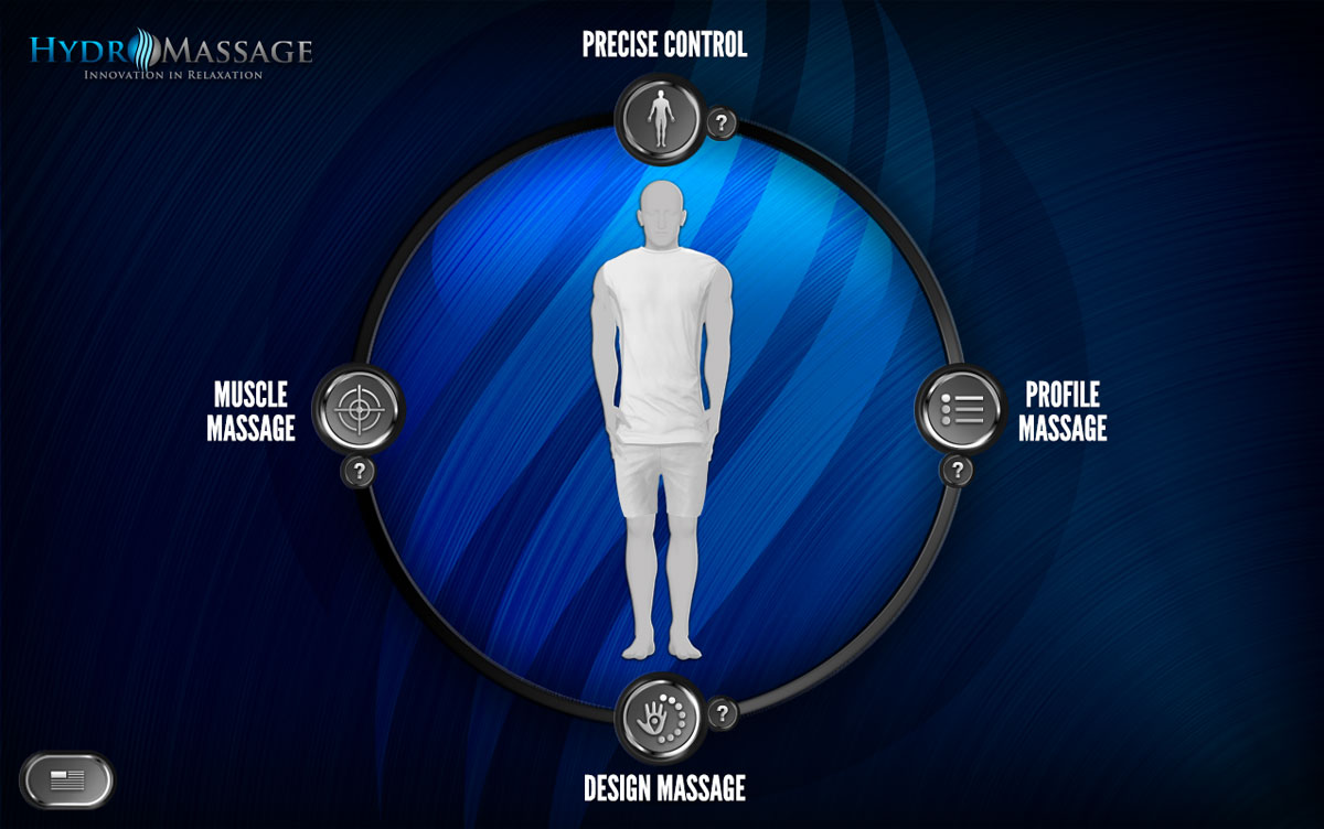
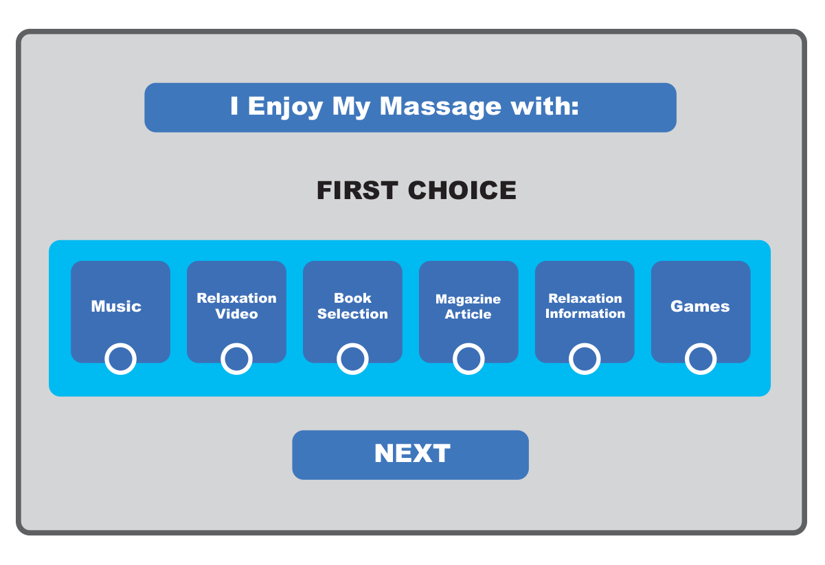
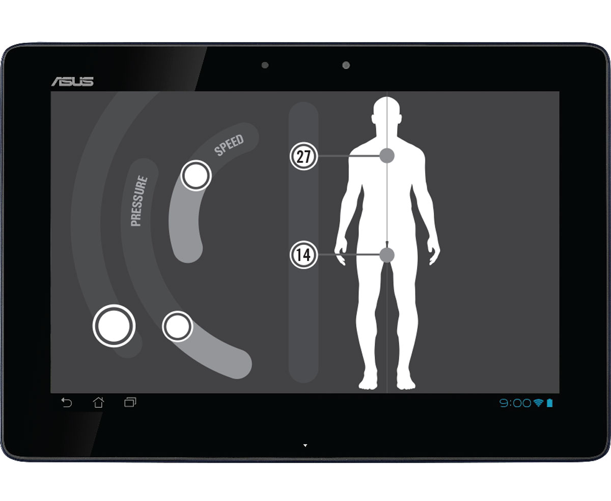
Hi and Lo Fidelity wireframes allowed us to iterate on solutions. My original concepts (pictured here) mimicked the images we collected in the comparative analysis, depicting the human figure in the perspective of the user, laying down. Formative evaluation was issued informally amongst staff to improve usability and feature architecture and flush out initial concerns in an environment where people held back nothing and had zero regret throwing a creative person under the bus.
Lo Fi Prototypes
We were able to use the wireframes in succession as lo fo prototypes to get feedback quickly. We printed them out and put them on screens to simulate touch capabilities, selections and drag and drop features within the space of the design.
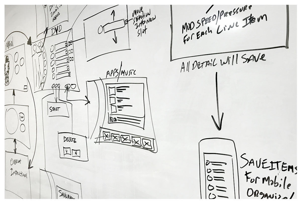
Wire Flow
To determine the flow of the UI, we hit the whiteboard, taking into account what solutions or ideas we may have not yet wireframed, so this gave us an opportunity to solve some additional user informed design considerations.
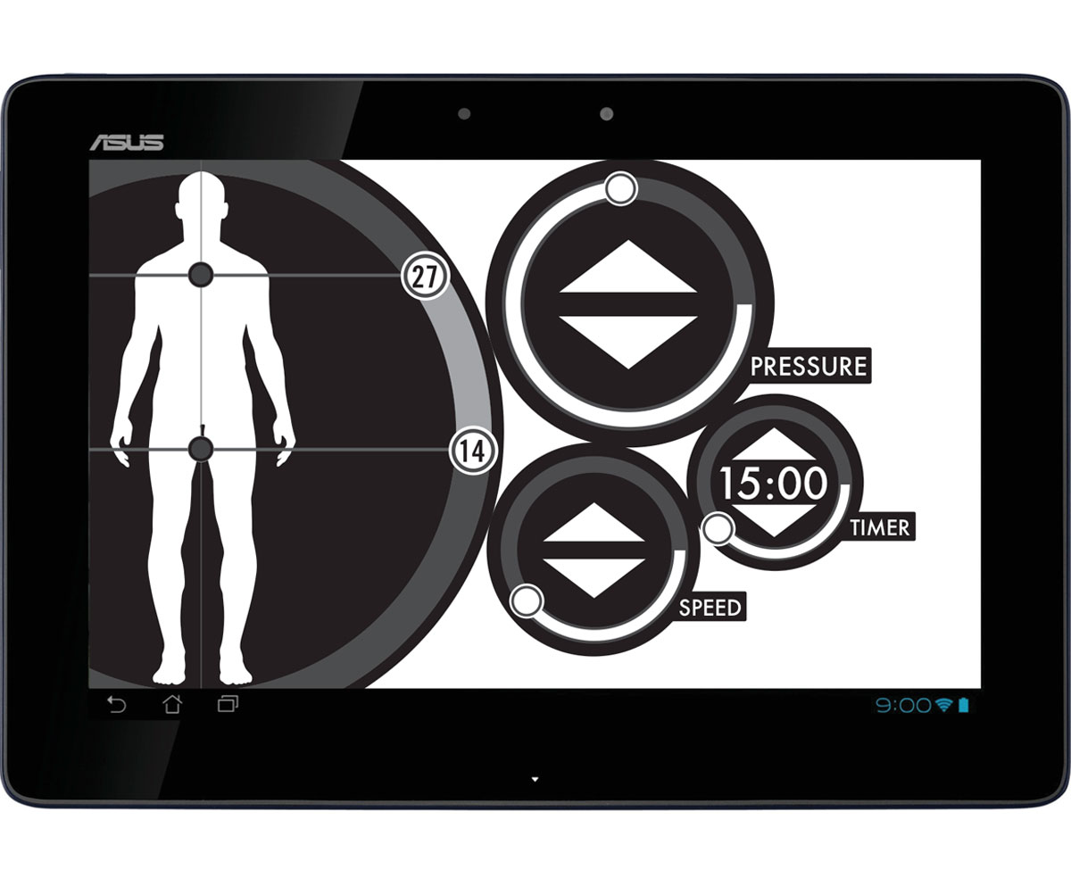
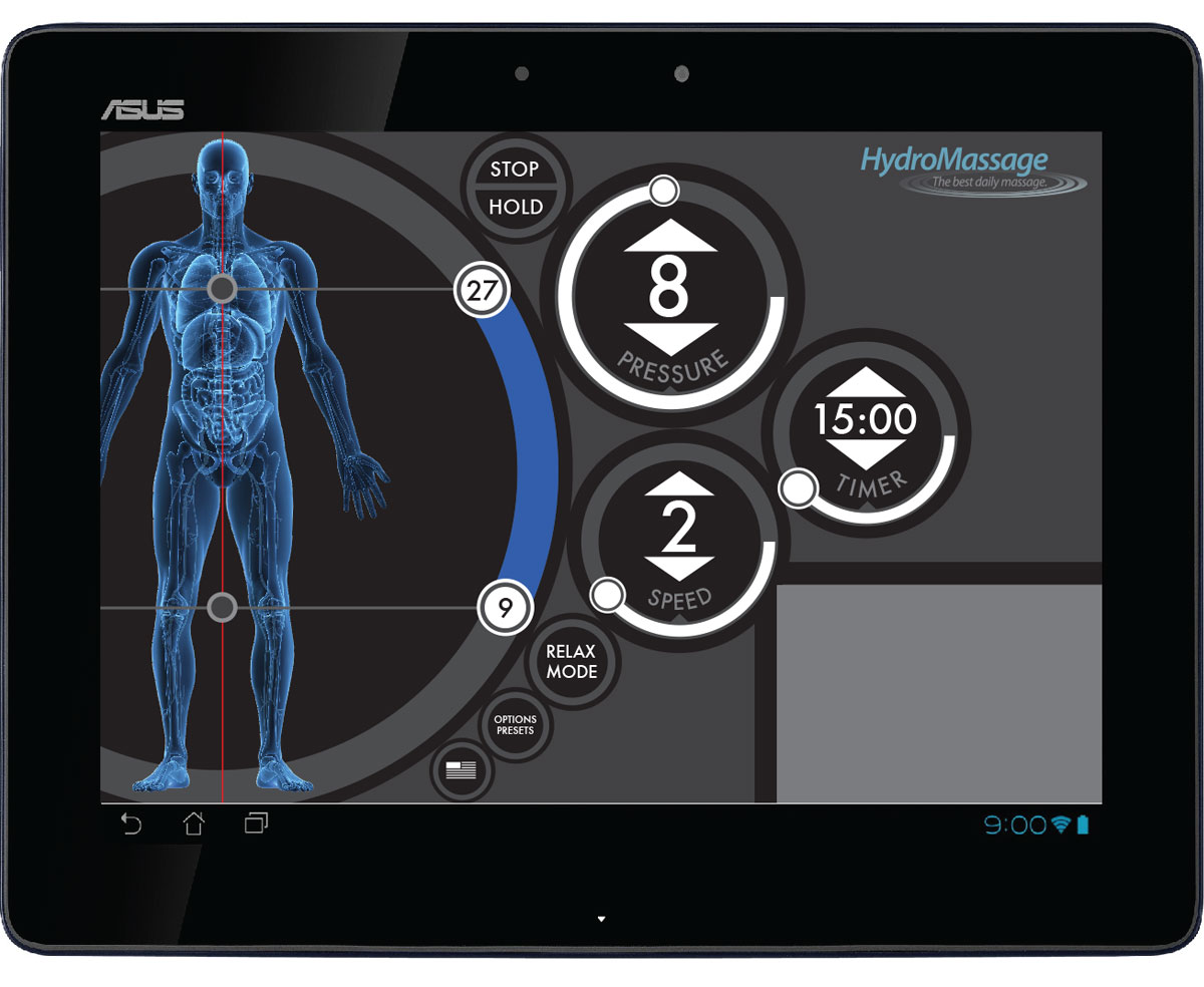
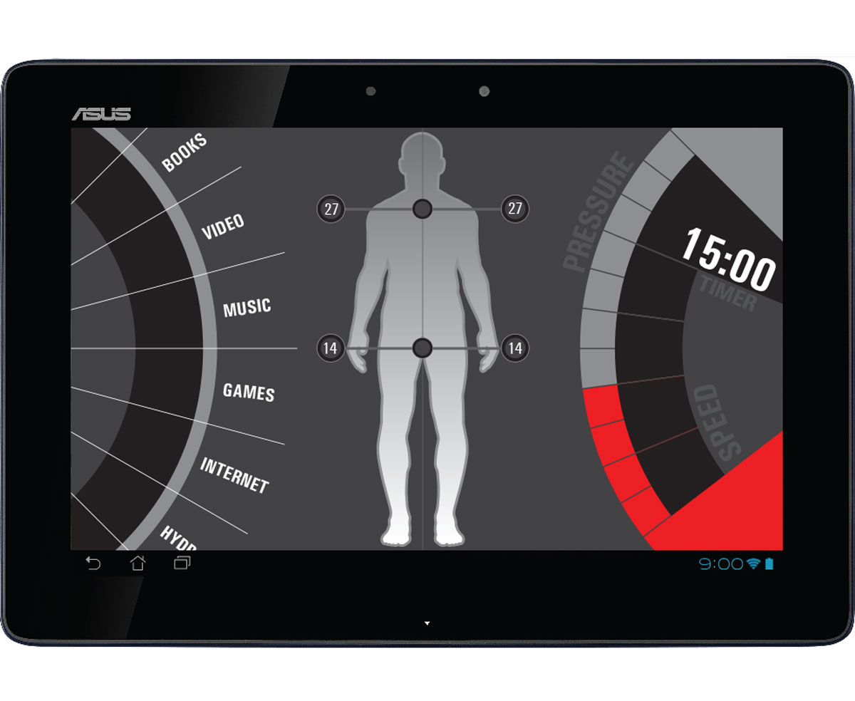
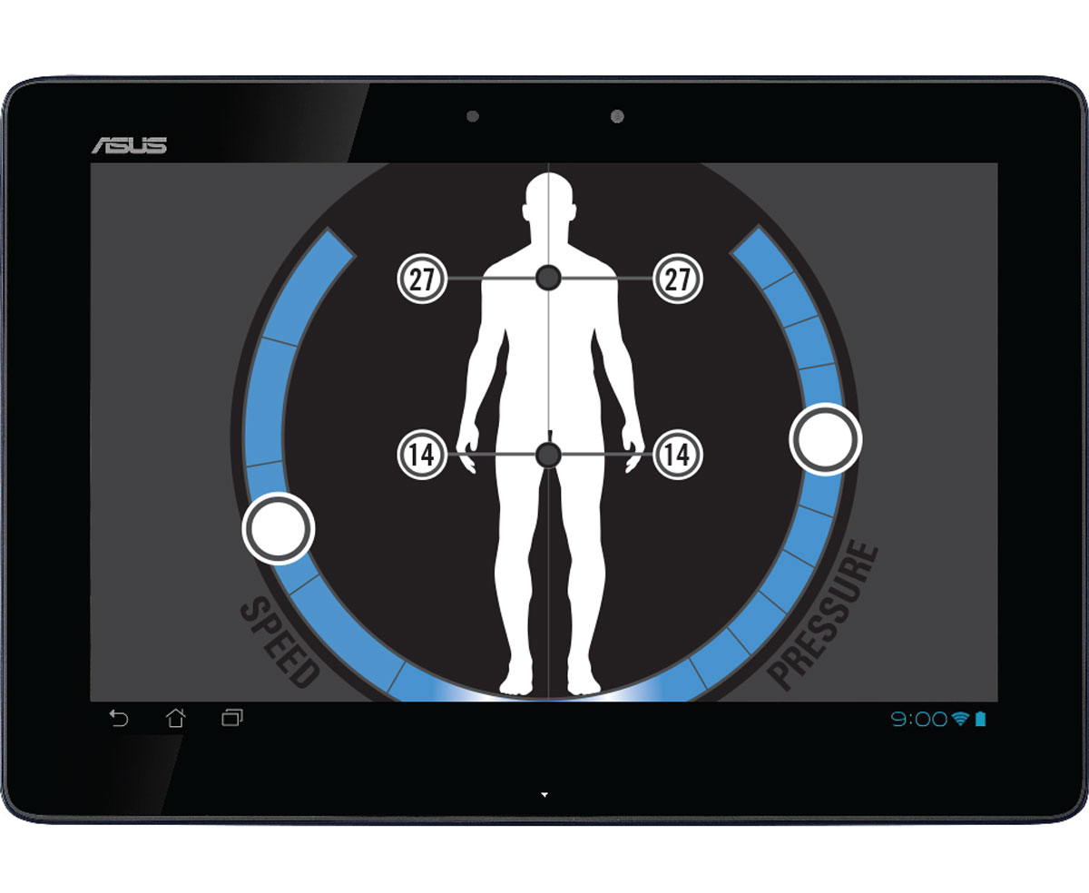
Hi Fidelity Mock Ups
Once we decided to mock up the UI it began to take on a realistic presence and reveal design patterns that would help determine final visual design efforts. Iterations were done to present more graphical elements into the wireframes, merging the structure with color and visual aesthetic.
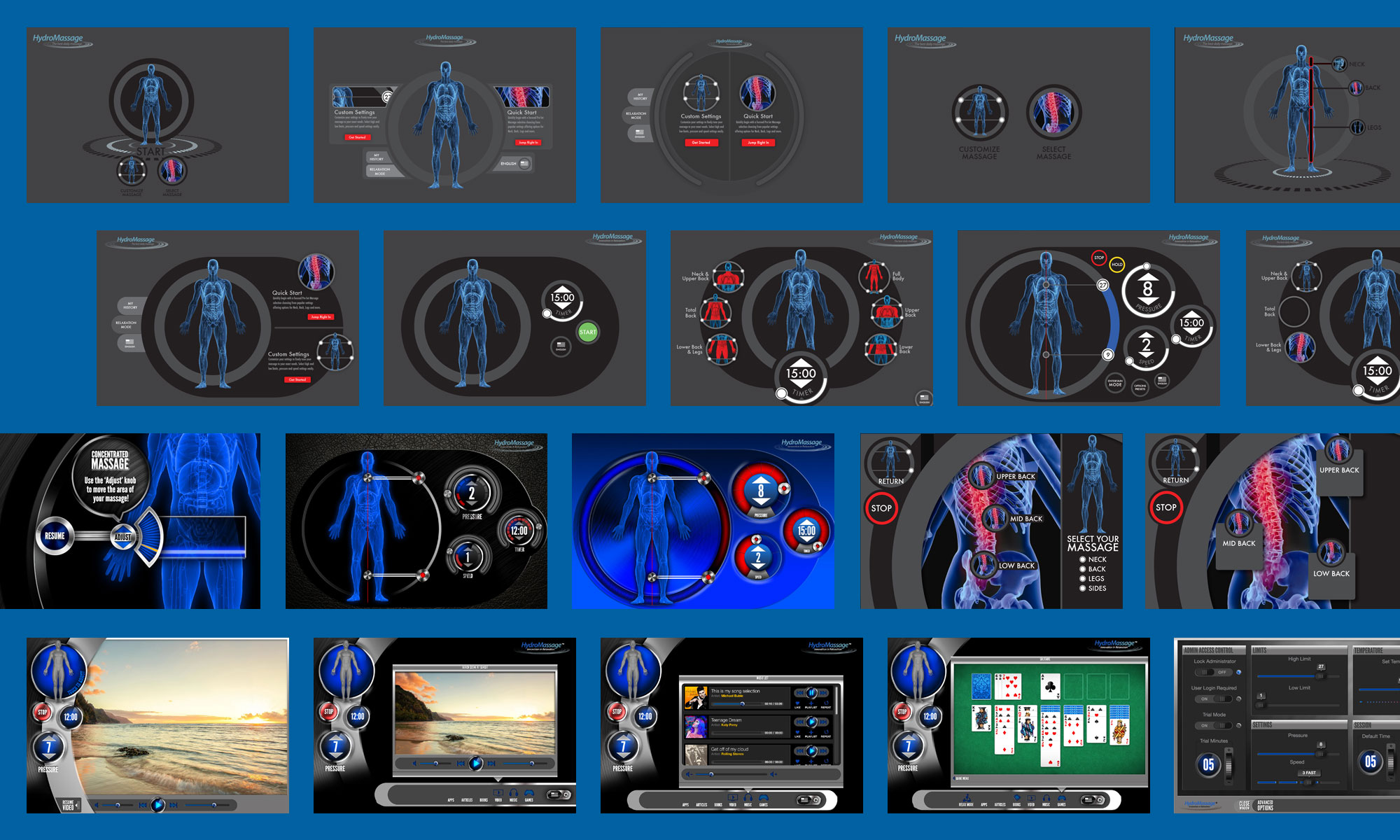

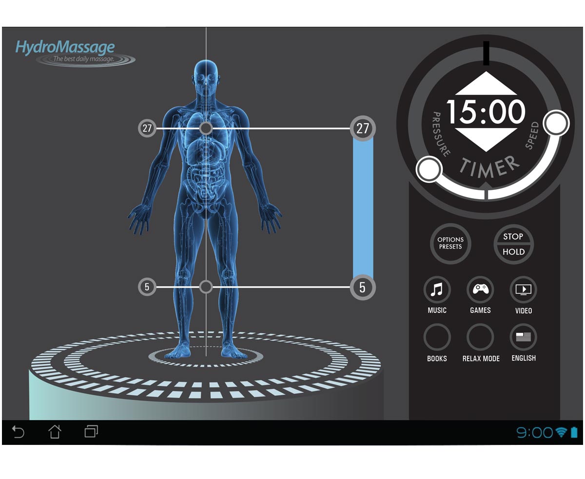
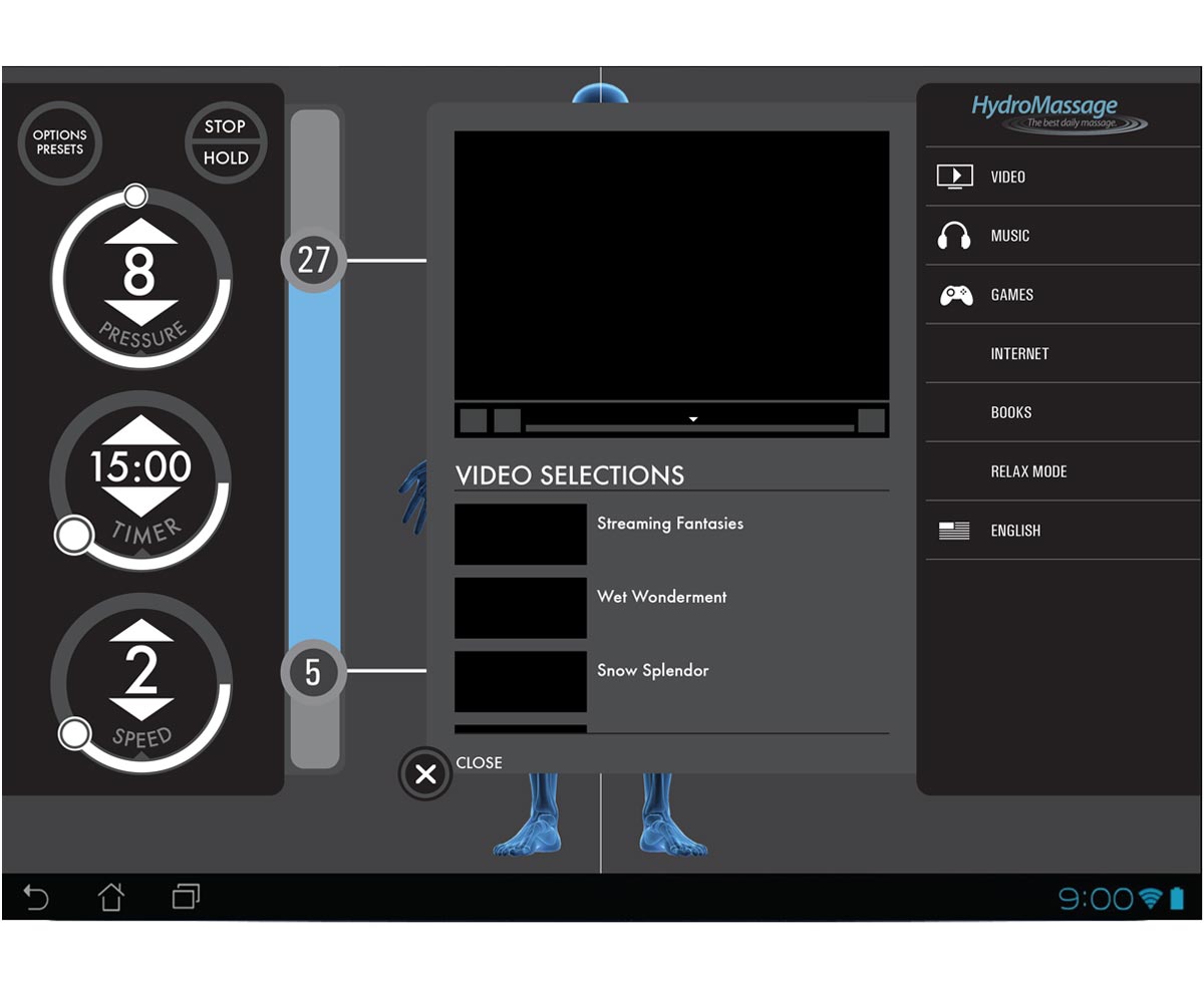
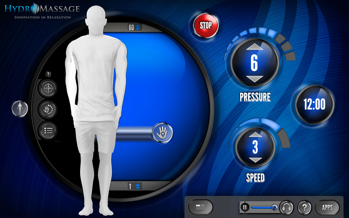
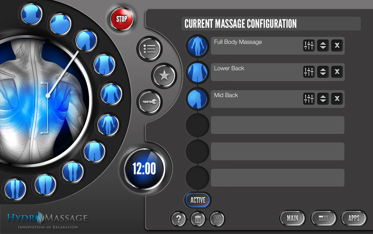
Visual Design
The final designs went through several iterations (pretty much like everything else), revising and refining. Options were built in to skin UI with client colors/backgrounds, options were refined, navigation was improved and formative user testing was performed along the way to tweak those little things you can't seem to see even though they are staring you in the face. In end stages we performed usability tests on and off the machine to get user input. Test performed on a MAC were recorded with video image of user and users were asked to comment aloud so we could get feedback. Probing questions in conjunction with anticapatory feedback was captured to qualify activities behind buttons. Usability tests help determine alignment of design thinking with user thinking and see if we have done our job right. Even if we had, we would probably iterate again.


Prototype
Below is the link to the Touchscreen V1. This is a FLASH module and will require the flash plugin be resident. This prototype is not the final product and may contain glitches. This was an essential part of our testing process and attributed to many of the changes made after this revision and much of the communication to stakeholders and investors at this part of the project.